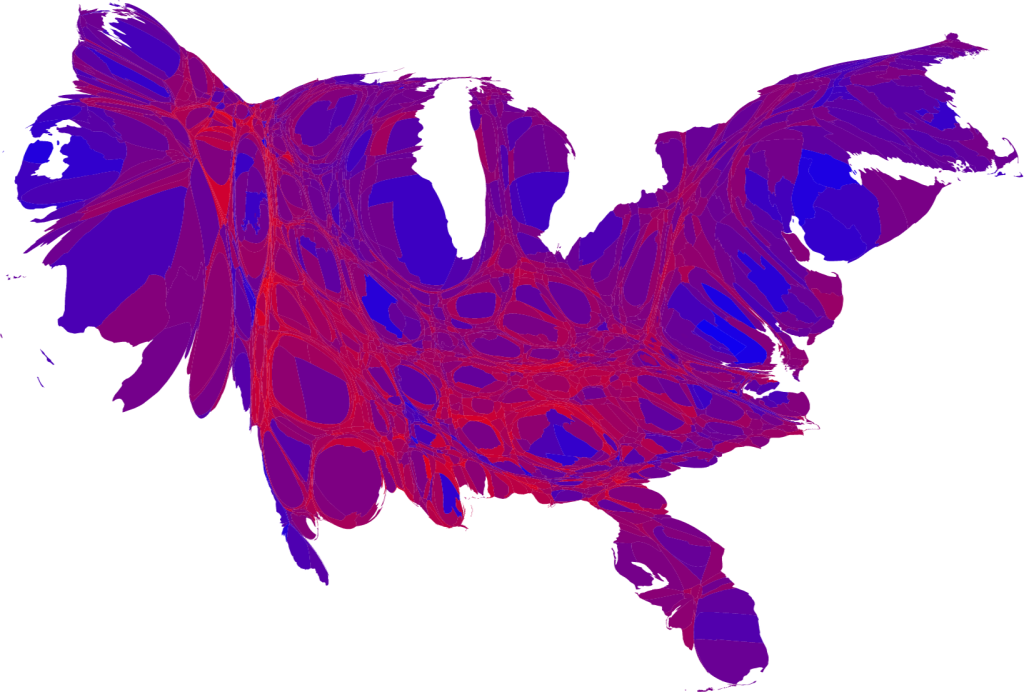
A guy named Mark Newman (no relation that I know of) has made some pretty cool maps showing the results of the most recent election.
He also explains that a cartogram is a map in which the sizes of states are rescaled according to their population.
As you know red plus blue makes purple.
This is the map that makes the most sense to me
No comments:
Post a Comment